Diversity in the US, mapped

The United States is sometimes billed as a melting pot of racial and ethnic diversity. Image: REUTERS/Damir Sagolj
The United States is sometimes billed as a melting pot of racial and ethnic diversity.
But a new map created by astrophysicist Tomasz Stepinski shows how much racial segregation persists in many American towns, cities, and suburbs.
Using census data and NASA satellite maps, Stepinski created a detailed map that shows racial composition levels in nearly every neighborhood in the US.
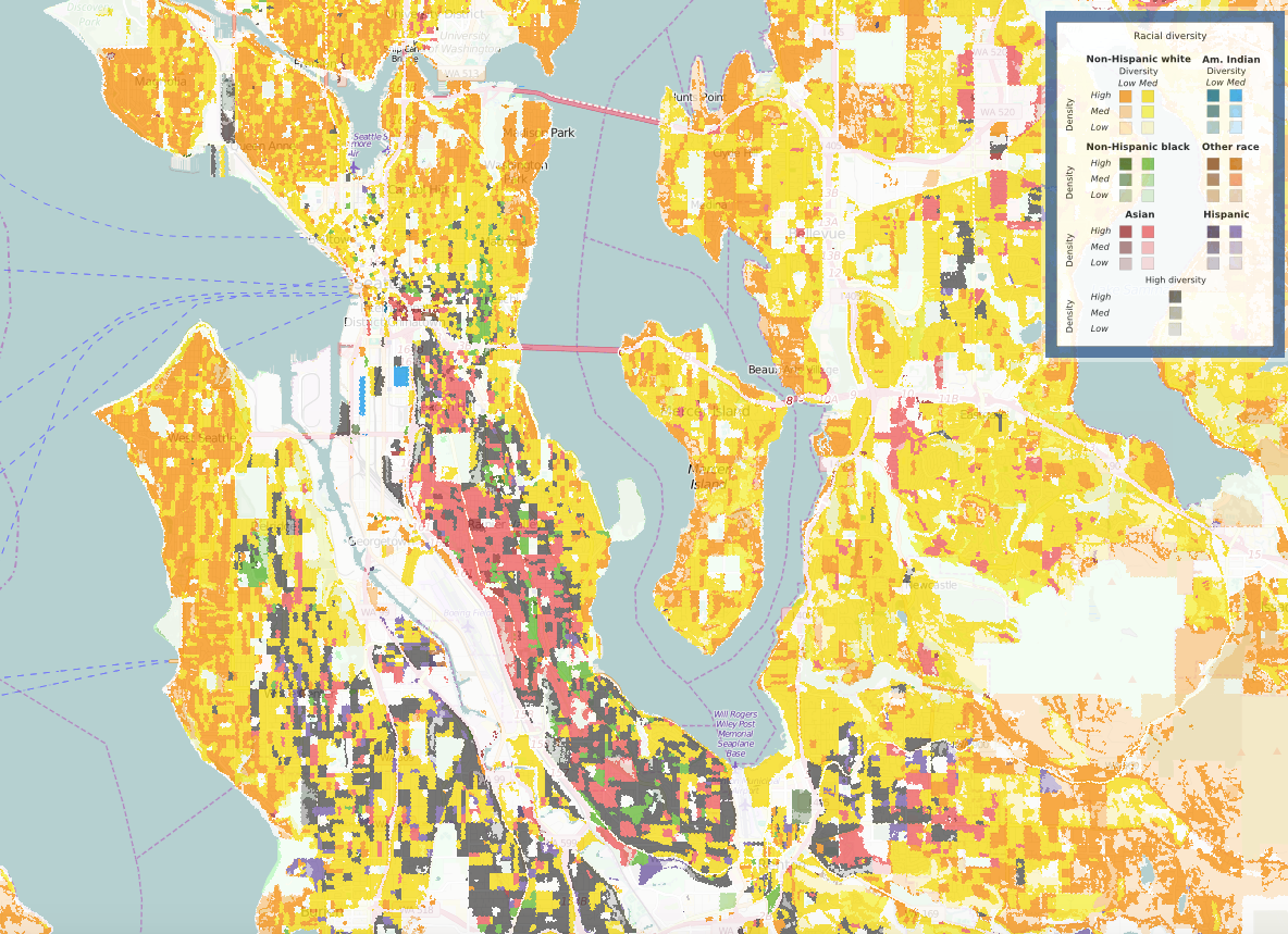
Six categories of race — non-Hispanic white, non-Hispanic black, American Indian, Asian, Hispanic, and other — are represented by six different colors on the map (as indicated on the key).

If an area has a high density of a particular race and low overall diversity, it is shaded a dark tone of that color (from the left column in the key to the right). If an area has a high density of a certain race but medium overall diversity, it's shaded in a less dark color (from the right column in the key). For example, neighborhoods with a high density of white residents and low overall diversity are shaded orange. Places with a high density of Hispanic residents are dark purple. The lighter the shade, the less densely populated that group is.
Areas with high racial diversity levels overall are shaded gray.
The interactive map chronicles data from 1990 to 2010, so users can zoom in and see how areas have changed over time. Stepinski presented his work on April 27 at the annual Population Association of America conference in Chicago.
Here is the state of diversity in seven US cities as of 2010, according to Stepinski's map.
Chicago — one of America's most racially segregated cities — is highly siloed by neighborhood. There are distinct pockets of Hispanic and black residents living downtown, while first-ring suburbs have mostly white residents.

As CityLab notes, decades of racial discriminatory housing policies (some of which still persist today) contributed to segregation in Chicago. For example, following WWII, the Federal Housing Administration explicitly denied home loans for black people in Chicago and other cities across the US.
New York City's neighborhoods are also pretty segregated by race. Manhattan has a fairly high density of white residents, while the most dense populations of black, Hispanic, and Asian New Yorkers are found in upper Manhattan, the Bronx, and parts of Brooklyn and Queens. Jersey City (located west of Manhattan) does not appear to be as segregated.

Gaithersburg, Maryland and other areas north of Washington, DC are fairly racially diverse, as indicated by the dark grey shading.

Oakland, California also displays a lot of gray splotches, signifying higher levels of racial diversity than San Francisco.

Stepinski's map also allows users to see changes in a city's diversity over time. In 1990, many neighborhoods in Seattle were divided by race.

But by 2010, parts south of downtown Seattle had become much more diverse.
"People don’t realize that the United States is a diverse country but at the same time is still very segregated," Stepinski told Quartz.

Stepinski said he plans to update the map with new census data in 2020.
Stepinski also said the map could help social scientists, city officials, and urban planners better understand the racial make-up of America's neighborhoods in order to help make them less segregated.

General disclaimer:
The designations employed and the presentation of material on this map do not imply the expression of any opinion on the part of the World Economic Forum concerning the legal status of any country, territory, city or area or of its authorities, or concerning the delimitation of its frontiers or boundaries.
Don't miss any update on this topic
Create a free account and access your personalized content collection with our latest publications and analyses.
License and Republishing
World Economic Forum articles may be republished in accordance with the Creative Commons Attribution-NonCommercial-NoDerivatives 4.0 International Public License, and in accordance with our Terms of Use.
The views expressed in this article are those of the author alone and not the World Economic Forum.
Stay up to date:
United States
Related topics:

Forum Stories newsletter
Bringing you weekly curated insights and analysis on the global issues that matter.
More on Technological InnovationSee all

Kary Bheemaiah, Antoine Tillette De Mautort, Connie Kuang and Simon Wardley
July 2, 2026


