5 charts that show global warming is off the scale

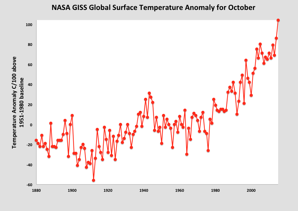
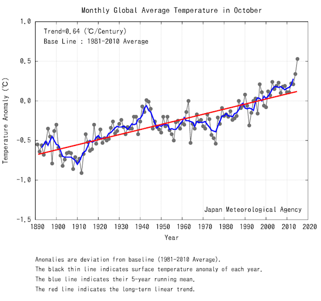
Not convinced global warming is speeding up? Take a look at these two charts from NASA and the Japan Meteorological Agency. According to their datasets, October 2015 was the hottest month since global records began.
This NASA chart illustrates how far the world’s surface temperatures have risen above the median rate over the past 135 years.
That’s not all. According to the Japan Meteorological Agency, in October the anomaly of the global average surface temperature (how far near-surface air temperatures have deviated from the norm) was 0.53 degrees Celsius above the 1981-2010 average – making it the warmest month since 1891.
So what’s driving up the heat? Well we are. Concentrations of man-made carbon dioxide, a major cause of global warming, have been increasing steadily since we become industrialized in the late 18th century. Scientists now warn that we are reaching the point of no return and will soon be unable to do anything to reverse climate change. This chart shows how levels of carbon dioxide have risen since 1751.

Adding to man-made global warming is El Niño. The weather pattern known for causing droughts and floods is gaining strength in the Pacific Ocean and could be the biggest one ever, according to reports. Already dubbed the “monster” El Niño, it could even surpass previous cycles in 1997 and 1982 – both of them classed as “super” El Niño.

Scientists are basing their predictions on the temperature of the Niño 3.4 region in the Pacific. The heat in this region is roughly four months ahead of global temperatures, as a 2010 NASA study explains, meaning that the world won’t really start feeling the heat until next year.
This final chart, based on data from NASA, shows the relative heat of the year 2015 (in bold, orange) compared with that of previous years. As industrial pollution and the Monster El Niño join forces, it looks like 2016 could be even hotter.

Have you read?
How plastic waste can stop global warming
How can we keep global warming below 2 degrees?
How we know our oceans are getting hotter
Author: Anna Bruce-Lockhart is an editor at the World Economic Forum
Image: An aerial view of the cracked ground of the Atibainha dam, part of the Cantareira reservoir, is seen during a drought in Nazare Paulista, Sao Paulo state February 12, 2015. REUTERS/Paulo Whitaker
Don't miss any update on this topic
Create a free account and access your personalized content collection with our latest publications and analyses.
License and Republishing
World Economic Forum articles may be republished in accordance with the Creative Commons Attribution-NonCommercial-NoDerivatives 4.0 International Public License, and in accordance with our Terms of Use.
The views expressed in this article are those of the author alone and not the World Economic Forum.
Stay up to date:
Future of the Environment

Forum Stories newsletter
Bringing you weekly curated insights and analysis on the global issues that matter.
More on Nature and BiodiversitySee all

Phil Cryle and Emily McKenzie
June 12, 2026