The map that will change how you see the world

People walk across a street in Tokyo. Image: REUTERS/Stringer
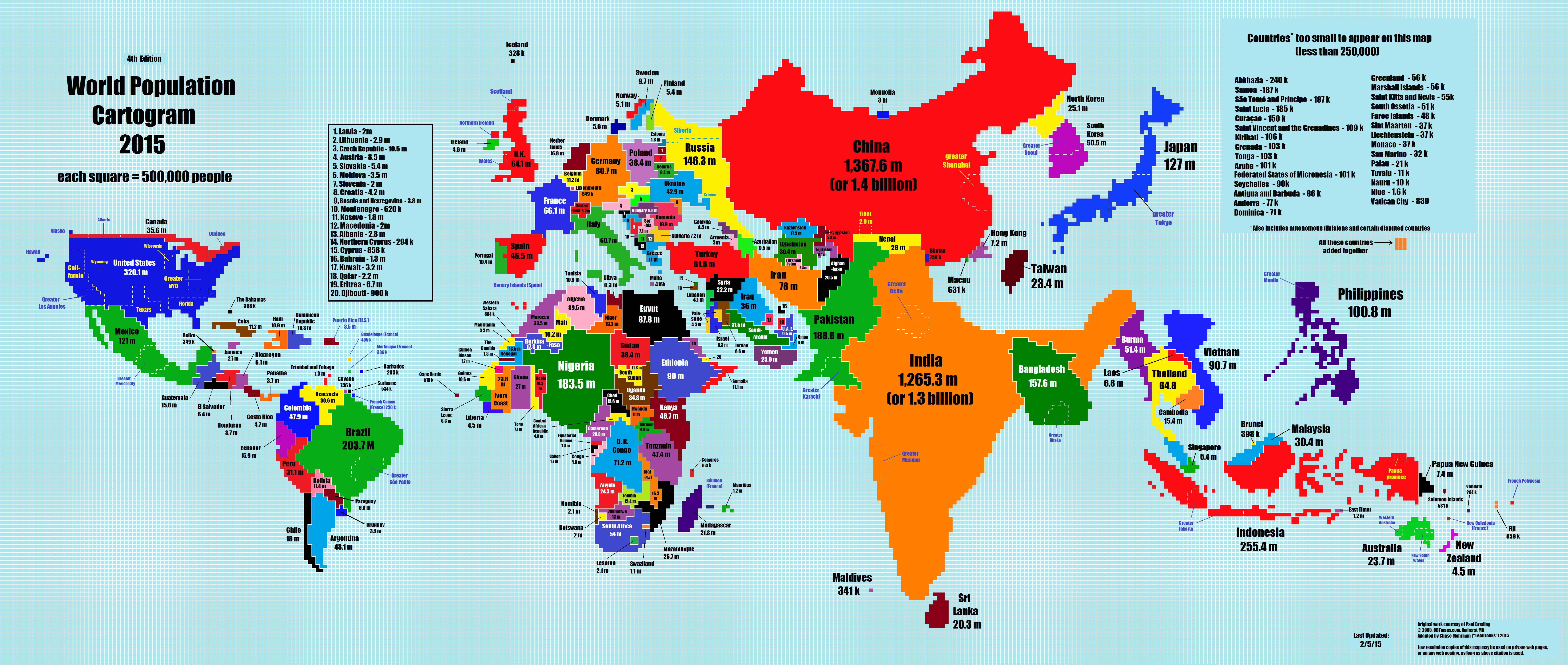
How do you view your country relative to others? Chances are if it’s based on most world maps, your view is distorted.
Trying to represent a sphere on a flat surface is inherently problematic. Those countries along the equator seem smaller, while nations such as Canada and Russia are commonly stretched and appear larger than reality.
But what if countries were scaled based on their population?
The following cartogram, based on the work of Paul Breding at ODT Maps, and adapted by Reddit user TeaDranks has done just that, and it could change your entire perception of the world. Cartograms scale a region’s geographic space according to a particular attribute and in this case each square now represents 500,000 people.
Based on work © 2005 & 2015, www.ODTmaps.com. All rights reserved.
We all know that India and China have large populations, but this map emphasises their size on a global scale. Compared to conventional world maps, the two Asian powerhouses dominate. Along with several East Asian neighbours – Bangladesh, Japan, the Philippines and Indonesia – their contribution to the global population is clear.
The size of Nigeria and Brazil compared to the rest of Africa and Latin America is equally apparent.
The map also effectively highlights the contribution of cities and regions to total populations. For example, the greater Tokyo region accounts for a significant proportion of Japan’s overall population. Equally, Delhi, Shanghai and Mumbai all occupy areas larger than many European nations.
At the other end of the scale, some economies which are barely visible on traditional world maps appear much larger on the cartogram. Consider the cases of Hong Kong and Taiwan, whose relatively large populations compared to their geographical sizes see them feature much more prominently.
Conversely, some countries which are very large on conventional maps can barely be seen. Canada, Russia and Australia are much smaller in this representation. Canada in particular disappears almost entirely.
Have you read?
This article has been updated to correct the source of the original map.
Don't miss any update on this topic
Create a free account and access your personalized content collection with our latest publications and analyses.
License and Republishing
World Economic Forum articles may be republished in accordance with the Creative Commons Attribution-NonCommercial-NoDerivatives 4.0 International Public License, and in accordance with our Terms of Use.
The views expressed in this article are those of the author alone and not the World Economic Forum.
Stay up to date:
Youth Perspectives

Forum Stories newsletter
Bringing you weekly curated insights and analysis on the global issues that matter.
More on Youth PerspectivesSee all

Christie Burley and Inés Yábar
November 5, 2025


