What does this chart tell us about the US economy?

The relationship between the U.S. unemployment rate and the job openings rate can reveal plenty about the economy. Image: REUTERS/Shannon Stapleton
In the wonkier corners of the internet, the release of new data from the monthly Job Openings and Labor Turnover Survey usually produces a graph that can be a bit bewildering to neophytes: the Beveridge curve. It shows the relationship between the U.S. unemployment rate and the job openings rate with the movement in the relationship sketched out over time.
The curve has garnered attention in recent years, however, because it “shifted out” after the Great Recession and hasn’t moved back yet. (See Figure 1.) This change in the curve caused some economists and analysts to believe that structural changes in the labor market shifted the equilibrium unemployment rate up.

The number of job openings seems to be quite out of line with hiring. But with unemployment hovering around 5 percent and wage growth still tepid, what does the shift tell us about the state of the labor market?
A shift out in the Beveridge curve could be a sign that firms are becoming pickier about who they hire, either due to changes in their preferences or because the available workers don’t fit their standards. That’s why the current shift has sparked concerns about a “skills mismatch” in the labor market.
But the shift now is due entirely to the increased share of workers who have been unemployed for longer than 27 weeks. (See Figure 2.) The long-term unemployed curve seemed to be shifting back late in 2015, until an increase in the labor force participation rate arrested the shift.

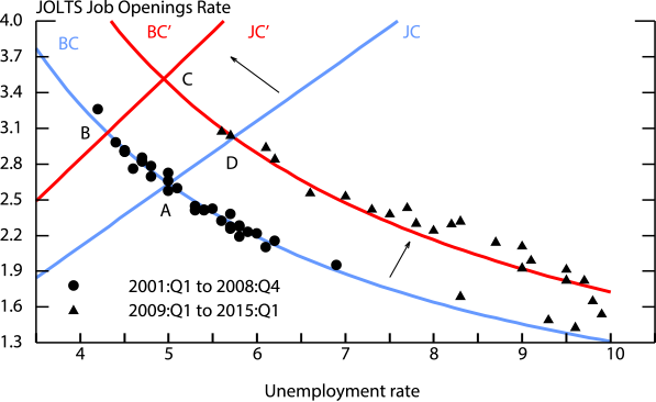
But if looking at just one line seems to be a bit simplistic for understanding the labor market, that’s because it is. As Andrew Figura and David Ratner of the Board of Governors of the Federal Reserve System pointed out last year, the Beveridge Curve only describes where flows in and out of unemployment are consistent with a given vacancy rate. But by itself it doesn’t determine the equilibrium unemployment and openings rates. For that, we also need to understand the job creation curve, the demand of firms for job openings at a given unemployment rate. (Check out Figura and Ratner’s depiction here.) The two economists make a convincing argument that changes in labor’s bargaining power and the increase in the profit share of income have made companies more willing to create job openings.
Why should we care about all these curves moving around? Take another look at Figura and Ratner’s figure. The place where the Beveridge curve and the job creation curve intersect determines the equilibrium unemployment rate, where the unemployment rate is consistent with the rates of job finding and leaving and firms are satisfied with the level of vacancies. Even though the labor share has gained a bit in recent months, the labor share is still below previous levels, and therefore it seems the job creation curve has moved in a direction where firms will create more job openings now for a given level of unemployment. The lower labor share implies that we have much further to go in pushing unemployment down to its natural rate.
Another question is what happens to the Beveridge curve. If the unemployment rate for long-term unemployed workers continues to stall, then the overall curve may not shift back to its previous spot. This would mean unemployment may be near its equilibrium rate right now. But if the curve does start shifting back (down and to the left), that means the equilibrium rate is lower than before and unemployment can go significantly below 5 percent. Clearly, we should keep an eye on these shifts.
Don't miss any update on this topic
Create a free account and access your personalized content collection with our latest publications and analyses.
License and Republishing
World Economic Forum articles may be republished in accordance with the Creative Commons Attribution-NonCommercial-NoDerivatives 4.0 International Public License, and in accordance with our Terms of Use.
The views expressed in this article are those of the author alone and not the World Economic Forum.
Stay up to date:
United States

Forum Stories newsletter
Bringing you weekly curated insights and analysis on the global issues that matter.
More on Jobs and the Future of WorkSee all

Till Leopold
November 14, 2025


