4 maps that will change how you see migration in Europe

Migrant children pose before passing the Austrian-German border in Achleiten.
Image: REUTERS/Michaela Rehle
Stay up to date:
Migration
Did you know that Polish people represent the highest percentage of the foreign-born population in Norway? Or that the largest proportion of immigrants to the Republic of Ireland hail from the UK?
These four maps, created by Jakub Marian, a Czech linguist, mathematician and artist, are based on a 2015 study by the United Nations on international migration. They show European migration split into various numbers:
1. The percentage of the population of each country that is made up of foreign-born migrants
2. The most common country of origin for that number
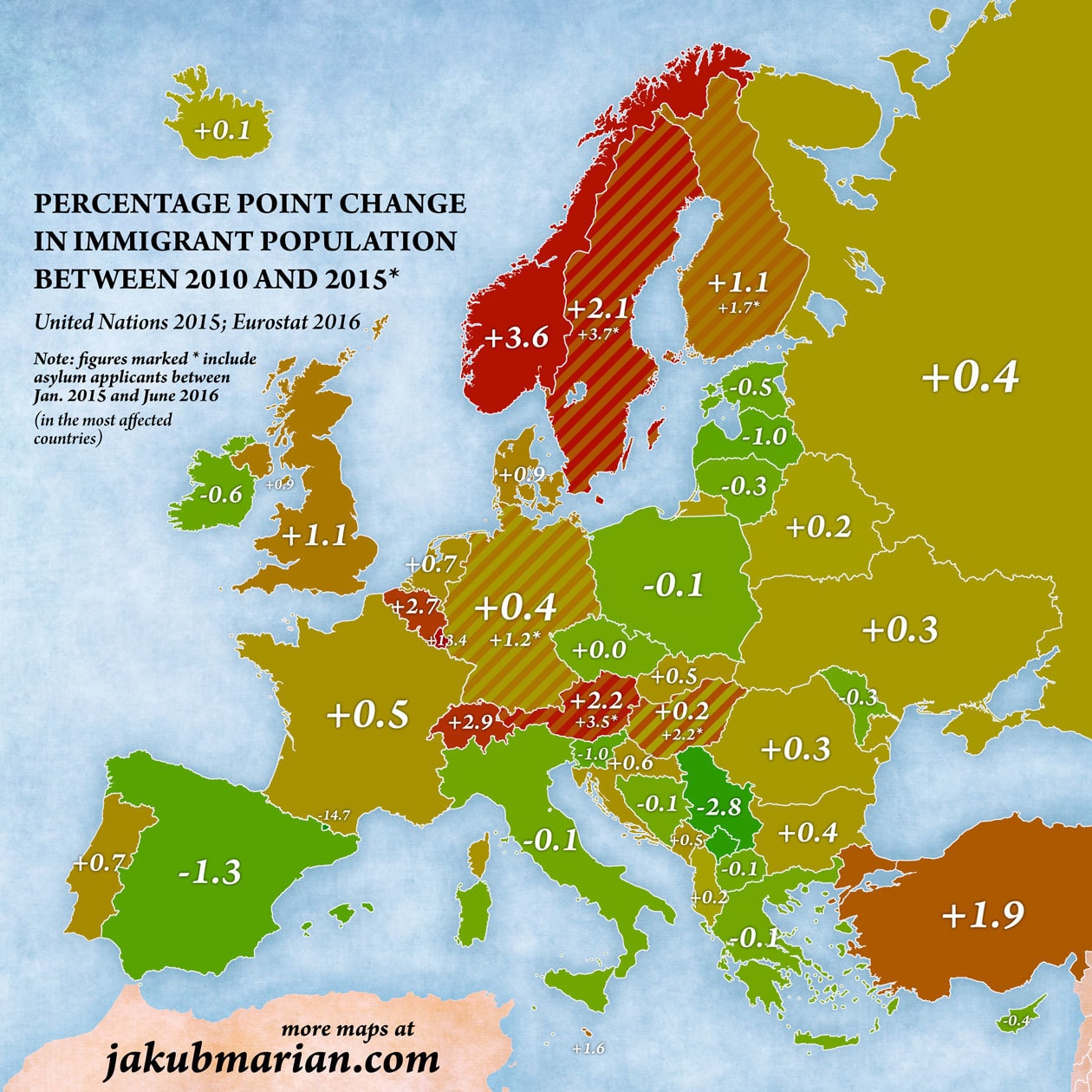
3. Whether that number has gone up or down in the past five years
4. The immigrant populations that are expanding the most
____________________________________________________________________________
Why Brexit will actually lead to a higher proportion of foreigners entering the UK
Are these the new migration superpowers?
____________________________________________________________________________
1. Number of foreign-born people as a percentage of the total population
In light of the Brexit vote, some might expect the UK to figure highly on this map, but it does not appear in the top five.

The population with the highest percentage of foreign-born people is Luxembourg (45.9%), followed by Switzerland (29.6%), Sweden (18.5%), Austria (17.4%), Estonia (15.8%) and Germany (14.5%).
The UK comes in at 13.4%.
Using data from Eurostat on asylum applications between January 2015 and June 2016, Marian then mapped which countries have been most affected by the European migration crisis. Austria and Sweden were the only European countries to register an above 1% increase in their foreign-born populations as percentage of the total, while Germany showed a less than 1% increase.
2. Where do the majority of immigrants come from?
The highest proportion of immigrants to the UK in 2015 hailed from India; for Norway, it’s Poland; and for Austria and Switzerland, it’s neighbouring Germany. Most of the Republic of Ireland’s foreign-born population comes from the UK.

France, Spain and Portugal’s immigrants come from further south (Algeria, Morocco and Angola respectively). For Greece and Macedonia, FYR, it’s Albanians. Poland and the Czech Republic saw the most immigrants from the Ukraine. In many eastern European countries, Russia has provided the most immigrants.
3. How that number has changed in the past five years
Marian’s third map shows how the political upheavals of the past five years have affected the original immigration figures.

The trends in map one, which showed the countries and their foreign-born population percentages, continue in map three.
For instance, Luxembourg, Switzerland, Sweden, Austria and Norway, which showed the highest percentage of foreign-born people compared to overall population, also saw the highest increases in immigrant populations between 2010 and 2015. The UK and Finland followed close behind.
The countries with the largest migrant populations settling elsewhere were Poland, Serbia, Germany and Romania.
4. The immigrant populations expanding the most in each country
In his fourth and final map, Marian looked at the immigrant populations expanding the most in each country by comparing the UN figures from 2010 to those of 2015.

Some countries, such as Poland and Greece, showed a decrease in their immigrant populations as a percentage of their populations. For around half of European countries the pattern remained more or less the same as the figures from 2015 (map 2), including Indians to the UK, British to Ireland and Poles to Norway.
Differences in other countries included more Cubans to Spain (Morocco previously), fewer Russians moving to eastern European countries, and an increase in Syrians as a percentage of the population of Sweden.
However, these figures, especially where declines are shown, could also be the result of a general fall in the population as a whole.
The designations employed and the presentation of material on these maps do not imply the expression of any opinion on the part of the World Economic Forum concerning the legal status of any country, territory, city or area or of its authorities, or concerning the delimitation of its frontiers or boundaries.
This article has been corrected.
Don't miss any update on this topic
Create a free account and access your personalized content collection with our latest publications and analyses.
License and Republishing
World Economic Forum articles may be republished in accordance with the Creative Commons Attribution-NonCommercial-NoDerivatives 4.0 International Public License, and in accordance with our Terms of Use.
The views expressed in this article are those of the author alone and not the World Economic Forum.
Forum Stories newsletter
Bringing you weekly curated insights and analysis on the global issues that matter.
More on Geographies in DepthSee all
Yusuf Maitama Tuggar
July 10, 2025
Kaiser Kuo
June 24, 2025
Kaiser Kuo
June 19, 2025
Aimée Dushime
April 18, 2025
Samir Saran and Anirban Sarma
April 17, 2025
Nada AlSaeed
April 16, 2025


