This map might change how you view the world

A population perspective. Image: REUTERS/Stringer
It’s likely you’re very familiar with the standard world map.
It’s shown practically everywhere – you’ll see it online, on the news, in books, and even as a part of company logos. In fact, the world map is so ubiquitous that we don’t even really think about it much at all, really.
The economist Max Roser from Our World in Data argues that this familiarity with the world map may lead to complacency in understanding global matters. After all, the typical world map shows us the basic geography of countries and continents, but it doesn’t give any indication of where people actually live!
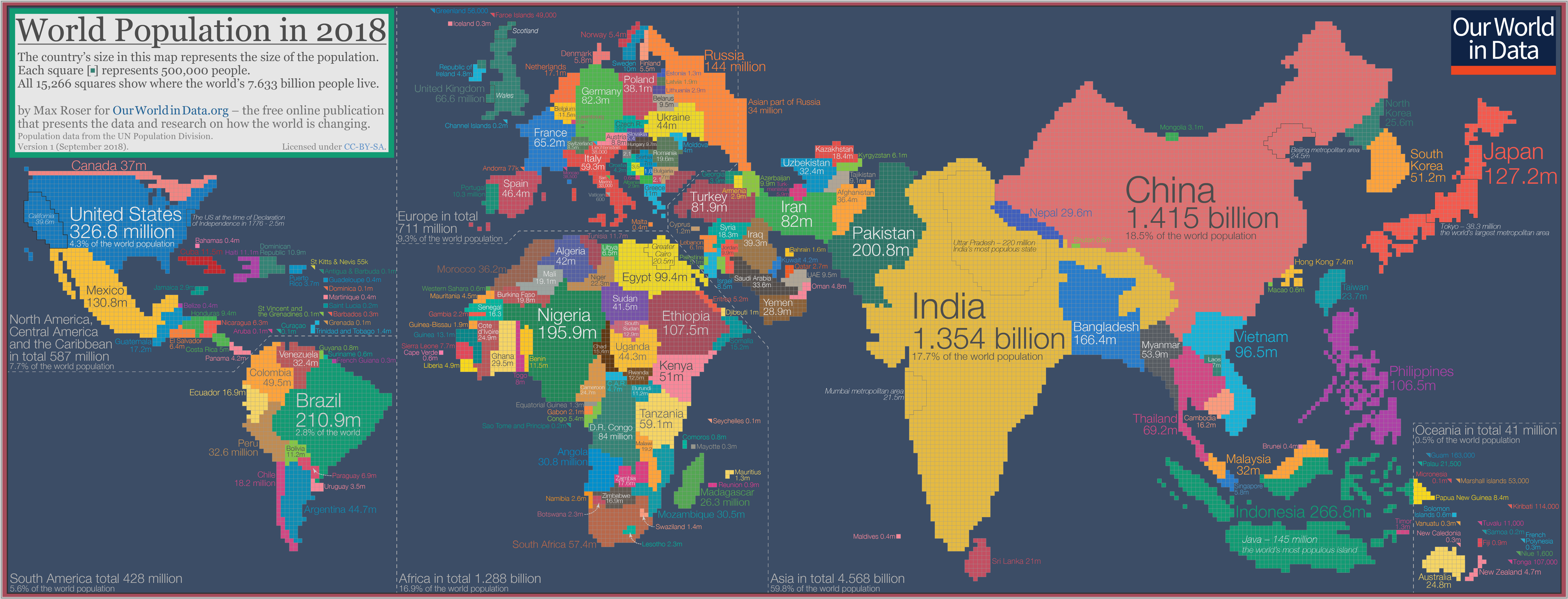
Introducing: the cartogram
To get around the challenges of relying on the standard world map, Roser instead has made a population cartogram based on 2018 population figures.
What’s a population cartogram?
A cartogram is a visualization in which statistical information is shown in diagrammatic form. In this case, it’s a population cartogram, where each square in the map represents 500,000 people in a country’s population.
In total there are 15,266 squares, representing all 7.633 billion people on the planet.
Countries like Canada or Russia – which have giant land masses but small relative populations – appear much smaller on this kind of map. Meanwhile, a country like Bangladesh grows much bigger, because it has a large population living within a smaller area.
The regional view
Let’s zoom in on some continental regions to get a sense of what we can learn from a population cartogram done in this fashion.
Asia and Oceania
Where did Australia go? The continent is completely dwarfed by neighboring Indonesia and the Philippines.

Not surprisingly, India and China are the biggest countries on this cartogram, especially looking oversized in comparison to countries in the Middle East like Saudi Arabia, Afghanistan, or the United Arab Emirates.
Europe
Geographically, Russia is a pretty massive country – but when resized based on population, the nation looks closer in size to many other European nations.

The Netherlands and Belgium, two countries with higher population densities than most European nations, also appear more prominent on this style of map.
The Americas
On the map below, Mexico has exploded to almost 4X the size of Canada. That’s because although the Great White North is the world’s second largest country in size, it only has a fraction of the population of Mexico.

Meanwhile, it’s evident that Argentina’s population is lower than the country’s giant landmass leads on.
Africa
Finally, we’ll look at Africa, which is in the middle of a massive population boom.

Countries like Namibia, Botswana, and Chad almost disappear.
Nigeria, which is expected to have the world’s largest city by 2100 with over 88 million residents, is the largest country in Africa using this cartogram method.
The designations employed and the presentation of material on these maps do not imply the expression of any opinion on the part of the World Economic Forum concerning the legal status of any country, territory, city or area or of its authorities, or concerning the delimitation of its frontiers or boundaries.
Don't miss any update on this topic
Create a free account and access your personalized content collection with our latest publications and analyses.
License and Republishing
World Economic Forum articles may be republished in accordance with the Creative Commons Attribution-NonCommercial-NoDerivatives 4.0 International Public License, and in accordance with our Terms of Use.
The views expressed in this article are those of the author alone and not the World Economic Forum.
Stay up to date:
Global Governance

Forum Stories newsletter
Bringing you weekly curated insights and analysis on the global issues that matter.
More on Global CooperationSee all

Sebastian Buckup and Maximilian Martin
November 13, 2025


