11 ways to see how climate change threatens the Arctic

Visualising and mapping the data is an effective way to show the impact of climate change around the North Pole. Image: REUTERS/NASA/Michael Studinger/Handout
The data is irrefutable and sobering: climate change is very real and it is happening now. Nowhere is change more evident than the Arctic, where the warming has been taking place more quickly than on the rest of the planet.
Still faced with scepticism, how are scientists driving home the message? Visualising and mapping the data is an effective way to show the impact of climate change around the North Pole. These are 11 ways to see how the Arctic is changing.
1. "Sea ice extent" is a measure of how much of an ocean is covered by ice, and it’s a key feature of the polar climate system. Sea ice cover hit an all-time low in 2012.This chart is a good way to show incremental change and trends:

2. To help explain the monthly variation above, this chart shows changes in sea ice extent by percentage throughout the year:

3. These four maps of the Arctic show the ice shrinking over the years:

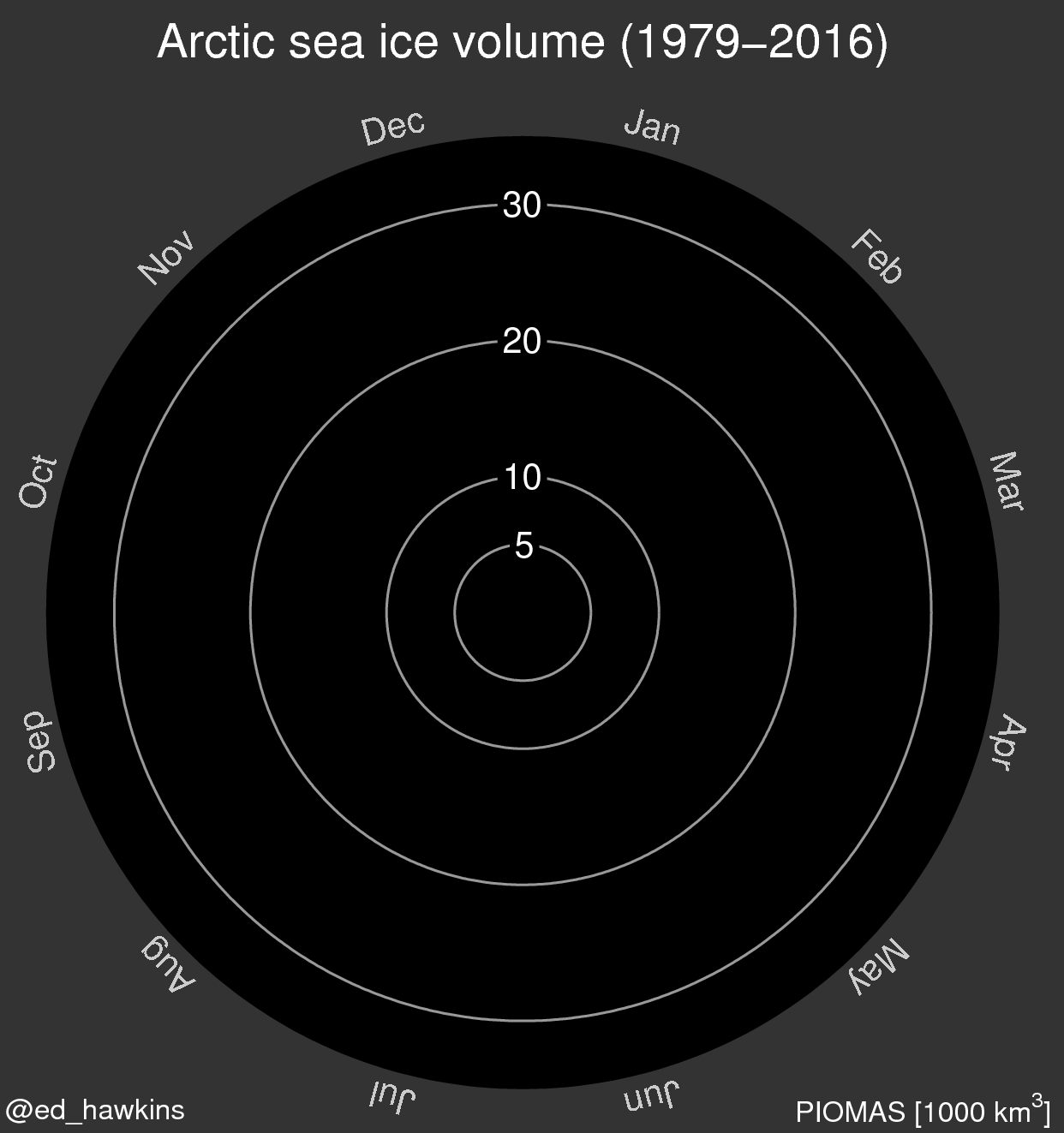
4. Climate change scientist Ed Hawkins created a spiral of sea ice volume from 1979 and 2016, allowing us to see the shrinking ice trend year on year.

5. Rising temperatures are the problem. This picture shows the temperature between October 2010 and September 2011 and red indicates where it was higher than the average of the past three decades. This confirms scientists’ estimates that the the Arctic is warming as much as two or three times faster than the rest of the planet:

6. Temperature increases in the Arctic are a result of bright ice reflecting more solar radiation than dark ocean waters. When ice melts, oceans absorb more radiation, causing in turn further warming, which leads to more ice melting. This graphic map shows the areas where this was very visible:

Red indicates an increase in solar radiation absorption between 2000 and 2014. The darkest red areas correspond to where reflective sea ice has declined, exposing darker ocean water.
7. Scientists are particularly concerned with loss of perennial ice, the oldest and thickest type of ice, which works as a buffer between Summer melts. Satellite imaging shows this decline very clearly:
8. The average depth of the Arctic ice has been decreasing dramatically as this NASA animated graphic illustrates:
9. The Arctic is becoming green for longer periods of the year. This map based on satellite measurements shows the changes from 1982 to 2012:

10. This map shows how warmer temperatures affect polar bears. Different environmental conditions affect polar bear populations in different ways, but overall the species is threatened as declining sea ice means they're unable to hunt seals:

11. These graphics forecast new shipping routes created by Arctic ice melting up to 2095 in a scenario of low carbon emissions and high carbon emissions. The Arctic Ocean could become a shortcut between Pacific and Atlantic ports by the end of this century. Pink lines represent routes by ships equipped for ice and blue show regular open water ships:

Don't miss any update on this topic
Create a free account and access your personalized content collection with our latest publications and analyses.
License and Republishing
World Economic Forum articles may be republished in accordance with the Creative Commons Attribution-NonCommercial-NoDerivatives 4.0 International Public License, and in accordance with our Terms of Use.
The views expressed in this article are those of the author alone and not the World Economic Forum.
Stay up to date:
Arctic
Related topics:

Forum Stories newsletter
Bringing you weekly curated insights and analysis on the global issues that matter.
More on Climate Action and Waste Reduction See all

Lin O’Grady and Alice Charles
April 7, 2026


