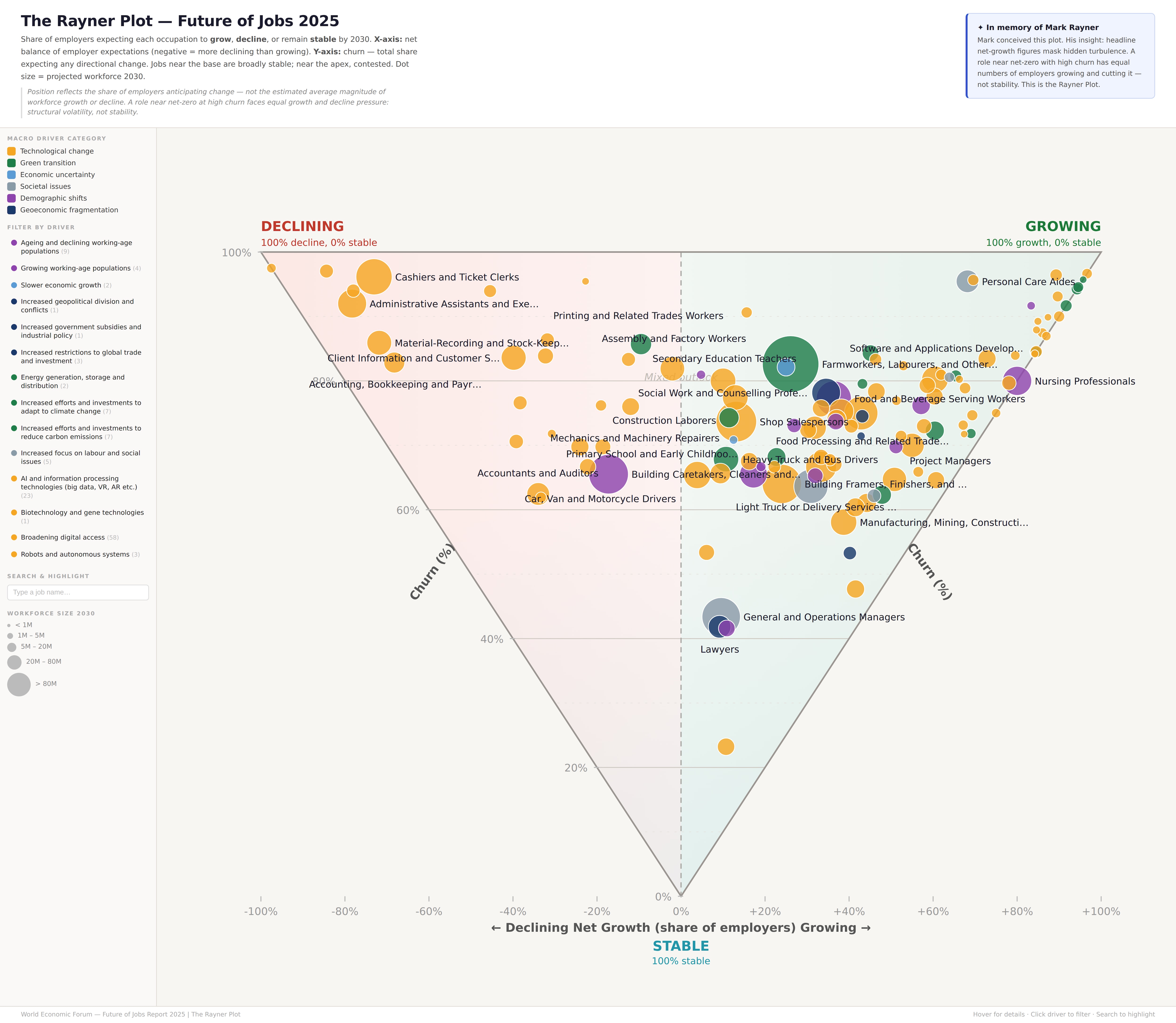
What is the Rayner plot and what can it tell you about the future of jobs?

The Future of Jobs report depicts three possibilities around whether roles will grow, decline or remain stable. Image: Unsplash/Evangeline Shaw
- The Future of Jobs Report explores expected job growth and decline but the outlook feels very different for someone in a role that is stable versus churning, where companies are downsizing and upsizing simultaneously.
- The Rayner plot is an interactive tool that explores these nuances for all professions in the Future of Jobs Report 2025.
Sometimes the most interesting story in labour market data isn’t the headline number but what sits underneath it. In the Future of Jobs Report, we track how roles are expected to grow or decline over the next five years. But those trajectories can take very different shapes beneath the surface.
Take drafters, engineering technicians and mapping technicians, for example. These roles are expected to grow 16% by 2030, following a trajectory similar to that of general and operations managers at 10%.
However, if we dig deeper, we see among employers hiring for technical drafting roles, 53% expect to increase hiring while 38% expect to reduce it (and just 9% expecting to hold employment levels stable) — making this one of the most dynamic and fast-changing roles in the dataset.
By contrast, 57% of employers expect to keep hiring for general and operations managers steady, making it one of the most stable roles.
Introducing the Rayner plot
This was Mark Rayner’s idea – a lead author on the report; it’s an exceptional depiction of the three possibilities – grow, decline or remain stable.
The X-axis shows the net balance of employer expectations, running from 100% expecting the role to decline to 100% expecting the role to grow. For example, "Car, Van and Motorcycle Drivers" are at the midpoint, with almost the same number of employers expecting growth and decline.
The Y-axis shows job stability. At the bottom, we see jobs that all employers expect will remain stable, while the top shows jobs that no employers expect will remain stable.
Now, let’s take a look at the diagram for all occupations in the Future of Jobs Report 2025. Take your time, there’s a lot going on here – we even threw in two extra dimensions: the size of the dot represents the total number of global workers, while the colour represents the main macrotrend driving change in each occupation.
(Click on the graphic to explore and interact using the filters on the left)
On Monday, 23 March, we lost Mark to a sudden illness. Our world is poorer without his caring nature, brilliant mind and deep passion.
Mark bought the rigour of a particle physicist to an economics role where his intellectual capacity often masked his connection to the lives of everyday workers and understanding of broad perspectives.
We miss you Mark.
Don't miss any update on this topic
Create a free account and access your personalized content collection with our latest publications and analyses.
License and Republishing
World Economic Forum articles may be republished in accordance with the Creative Commons Attribution-NonCommercial-NoDerivatives 4.0 International Public License, and in accordance with our Terms of Use.
The views expressed in this article are those of the author alone and not the World Economic Forum.
Stay up to date:
Future of Work

Forum Stories newsletter
Bringing you weekly curated insights and analysis on the global issues that matter.


