Chart of the day: These countries create most of the world’s CO2 emissions

With CO2 levels on the rise, being able to track global emissions is crucial. Image: REUTERS/Regis Duvignau
Just two countries, China and the US, are responsible for more than 40% of the world’s CO2 emissions.
With CO2 levels still on the rise, being able to track the global emissions hotspots is becoming more important than ever. Before the industrial revolution, levels of atmospheric CO2 were around 280 parts per million (ppm). By 2013, that level had breached the 400ppm mark for the first time.
On 3 June 2019 it stood at 414.40ppm.

There are huge disparities between the world’s top 15 CO2 emissions-generating countries. China creates almost double the emissions of second-placed US, which is in turn responsible for more than twice the level of third-placed India.
How the Forum helps leaders navigate the transition of energy and materials systems
Collectively, the top 15 generate 72% of CO2 emissions. The rest of the world’s 180 countries produce nearly 28% of the global total – close to the amount China produces on its own.
Of course, aggregating emissions by country is just one way of assessing the problem and working out how to counter it. The per capita figures tell a different story.
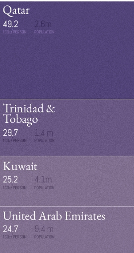
Here, China doesn’t even make the top 20. The per capita No 1 spot goes to Qatar, with Gulf States making up 3 of the top 4. The US is ranked 8th, behind Australia at 7th.
Looking at per capita figures rather than national-level totals could help bring the reality of the climate crisis closer to individuals. For example, a person may feel their decision to use less-polluting forms of transport is pointless in comparison to the colossal Chinese and American CO2 figures.
But seeing how population size alters the rankings, and where their country appears, may encourage people to see a connection between their actions and the results they can help bring about.
Don't miss any update on this topic
Create a free account and access your personalized content collection with our latest publications and analyses.
License and Republishing
World Economic Forum articles may be republished in accordance with the Creative Commons Attribution-NonCommercial-NoDerivatives 4.0 International Public License, and in accordance with our Terms of Use.
The views expressed in this article are those of the author alone and not the World Economic Forum.
Stay up to date:
Energy Transition
Related topics:

Forum Stories newsletter
Bringing you weekly curated insights and analysis on the global issues that matter.
More on Energy TransitionSee all

Kim Bugi
June 23, 2026


